Private First
Make choices that feel like they were built for Indie and Ivie, not for a market segment.
Brand toolkit v2
A private-family playroom polished enough to share. The site should feel handmade, warm, and specific to these girls: excavator rides, family branches, apples, owls, and tiny worlds that remember them.

This is not a generic kids brand. It is a family playroom with enough polish that every shared link, app icon, and game screen feels intentional.
Make choices that feel like they were built for Indie and Ivie, not for a market segment.
Buttons should invite tapping. Characters can be imperfect. The best detail is one a kid remembers.
Clean enough for a public link, but never corporate. Use simple language, soft depth, and visible joy.
Use sky, cream, and tree green as the environment. Use excavator yellow, apple red, and the sister colors as memory anchors.
#8bd8ff#fff7e7#ffbd2e#63c95a#d98123#76431f#ed5651#ffd85e#5a6f72#4fb1a7#ff6f8f#24313aKeep the rounded game feeling. The display style should feel like sticker lettering. Body copy stays calm and readable.
Display stack: Arial Rounded MT Bold, Avenir Next, Trebuchet MS, system UI. Use it for game names, button labels, badges, and short shouts.
Body stack: Avenir Next, Trebuchet MS, system UI. Use short sentences. Avoid explainers that sound like a product brochure.
The lockup should feel like a title card from the games: sky, grass, excavator, tree, and clear rounded lettering. Do not reduce the brand to initials.
Use the full scene lockup for the homepage, brand docs, social proof images, and places where the audience has enough room to read the name.
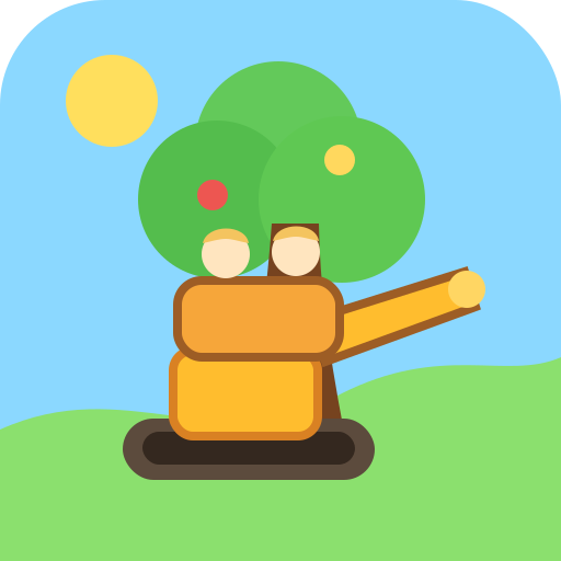
Use tree plus bucket plus sisters for app icons, saved-home-screen art, favicons, and small game-launch surfaces.
The interface should feel tappable and toy-like, but the layout should stay clean enough that parents can scan it quickly.
Chunky, high contrast, short verbs. Use for actions like Visit, Add, Hear, and Save.
One branch, one relationship, one detail. Keep the story specific and warm.
Boat captain who loves lake days.
Use simple scenes instead of abstract marketing graphics. Show the thing kids can play with.
Each game entry should show the play space, the kid-facing action, and one memory cue. Avoid generic app tiles.
Lead with the excavator bucket and branch visits. The tree, apples, and owl should stay visible when cropped.
Show rooms, props, and tiny home routines. Use warm interiors with one clear toy-like object as the focus.
Make the card feel like a tiny errand. Show groceries, cafe, toys, pets, or checkout instead of abstract commerce shapes.
Use rounded forms, thick friendly outlines, and simple shapes that a kid can recognize in one glance.
The writing should sound like a parent making something with care. Specific beats generic every time.
These are the current source assets for the site and future games. Keep new work in this same family unless there is a deliberate reason to branch out.
Use for the homepage, title cards, and internal docs.
Use for the Family Tree Lift entry point and share surfaces.
Tree plus bucket plus sisters. Avoid abstract initials.
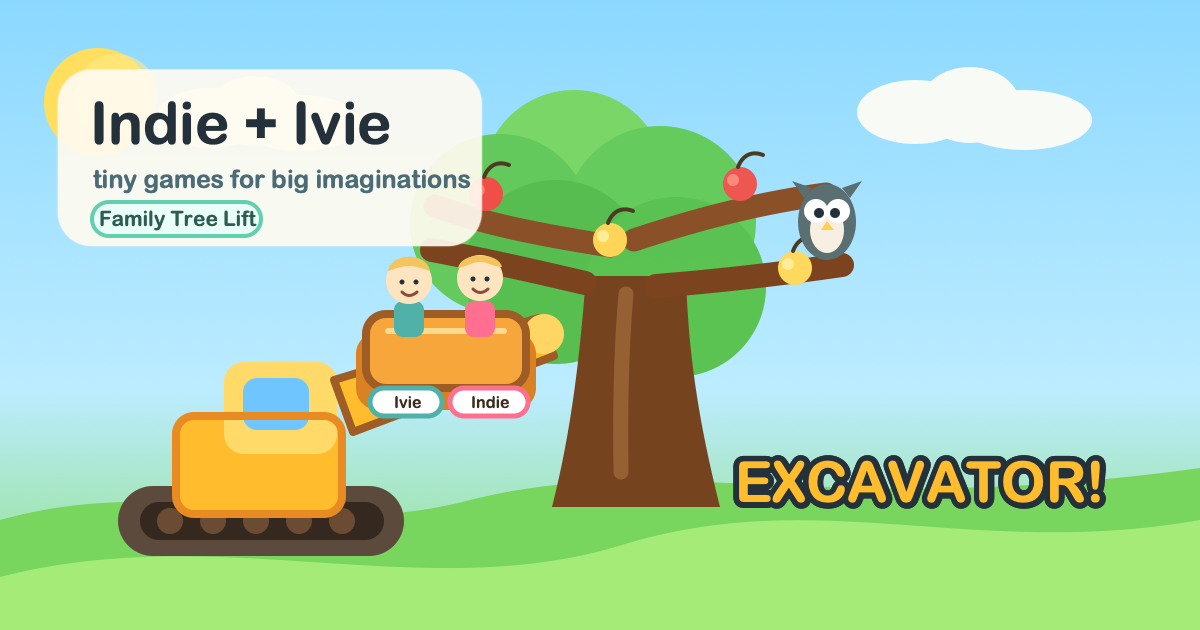
The current Open Graph image for indieivie.com.
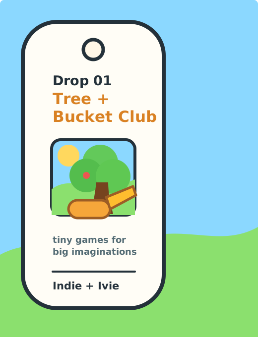
Stickers, shirts, and hats should feel like family-trip souvenirs from the tiny worlds, not like a logo slapped on blank goods. The next level is making it a named drop with packaging and print-ready rules.
A small Family Day Kit built around the strongest Indie + Ivie memory: the family tree, the excavator bucket, apples, and the girls' tiny-world colors. This gives the merch a collectible reason to exist instead of feeling like random swag.
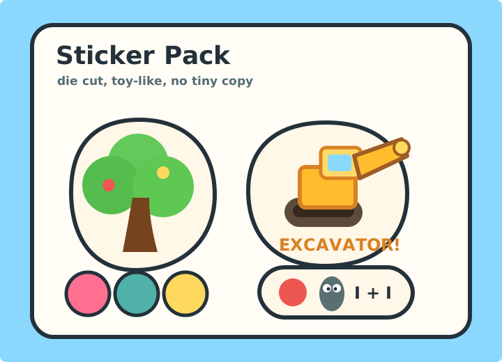
Make the first run die-cut vinyl: excavator shout, family tree, apple, owl, sister dots, and one simple Indie + Ivie mark.
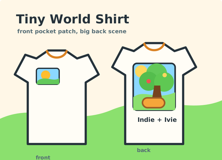
Use a small front patch and a big back scene. Cream shirt first; sky or excavator yellow can be limited-run colors.
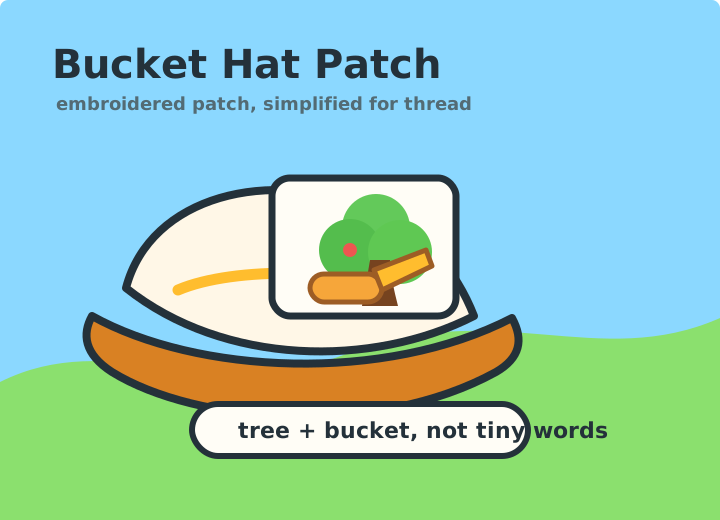
Use embroidery or woven patch logic: tree plus bucket, no tiny text, fewer leaves, thick outlines, readable from across a room.
These are the sizes and crops to keep consistent across share previews, home-screen icons, and launch surfaces.
Use the full excavator/tree scene. Keep faces, bucket, tree, apples, and owl inside the center safe area so social crops still read.
Use the compact tree and bucket mark as the source. Export 192, 512, maskable 512, and 180 Apple touch variants per game.
Use for Family Tree Lift cards, README previews, and handoff docs where a horizontal game label is clearer than the full brand lockup.
Use sky blue for browser chrome and PWA manifests unless the game has a stronger surface color, then keep it inside the same palette.
Use the CSS and JSON token files as the shared source for static pages, game shells, and future generated assets.
Import the token CSS for new static pages and keep app-specific CSS layered on top.
<link rel="stylesheet" href="/brand/assets/brand-tokens.css">

.primary-action {
  min-height: var(--ii-tap-target);
  border-radius: var(--ii-radius-pill);
  background: var(--ii-excavator-light);
}
Use the JSON for scripts that generate icons, docs, manifests, screenshots, or social exports.
{
  "exports": {
    "openGraph": { "size": "1200x630" },
    "appIcon": { "size": "512x512" }
  },
  "components": {
    "primaryButton": { "minHeight": "58px" }
  }
}
Use this checklist before sharing a game link, adding it to an iPad home screen, or generating new social art.